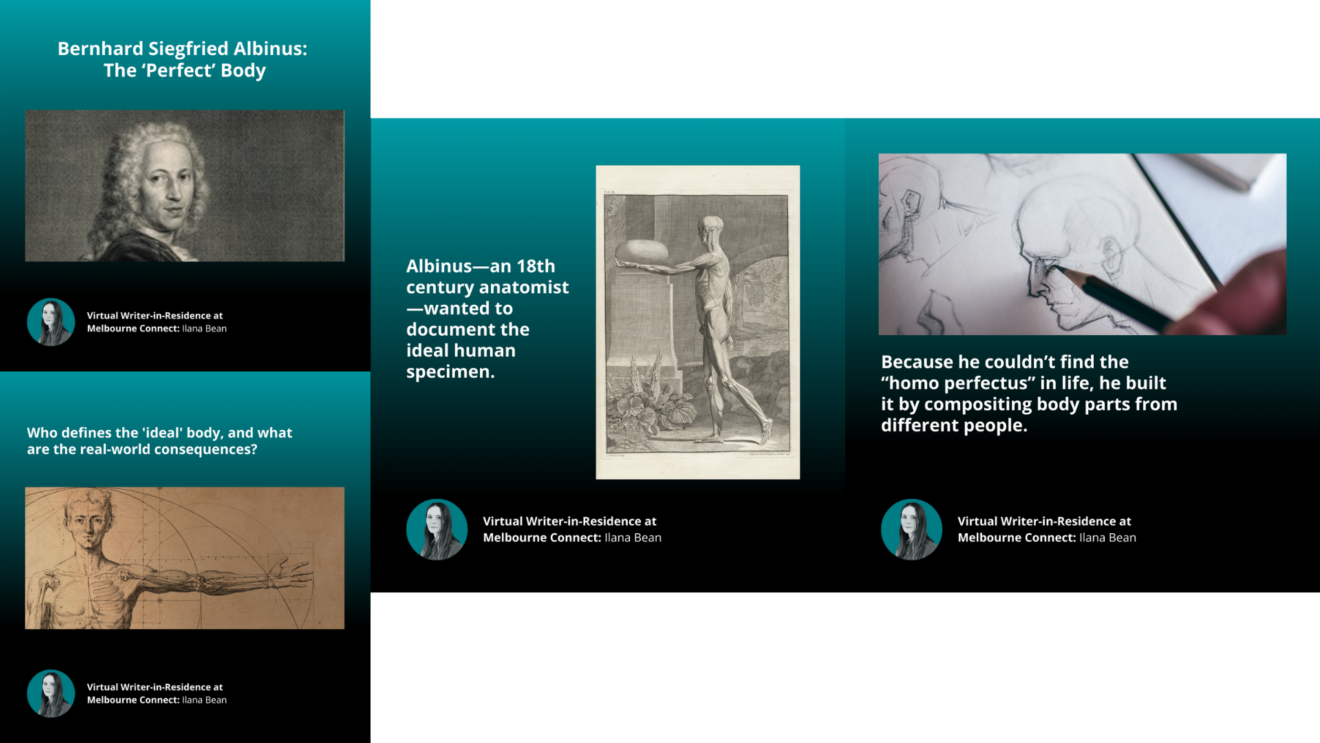
Like many people, Bernhard Siegfried Albinus longed for the perfect body. But he wasn’t concerned with his own appearance: instead, Albinus—an 18th century Dutch anatomist—wanted to work alongside his artist Jan Wandelaar to document and analyse the ideal human specimen.
Albinus believed that all people were flawed variants of the homo perfectus. He didn’t like that medical illustrations, like those done by Vesalius and his artists, often depicted a specific person. By “collecting data from one body after another, and making a composite according to the rule” Albinus believed the “actual truth will be displayed.”
Drawing the perfect human didn’t just mean surveying, measuring, and averaging out the limbs of different cadavers. Albinus was also looking for beauty. He searched for human specimens that met his expectations of ideal proportions, and, as one writer put it: “showed all signs of strength and agility, one that was elegant but at the same time not too delicate, that showed neither juvenile nor feminine roundness and slenderness nor uncouth roughness and clumsiness; in short, one whose parts were all beautiful and pleasing to the eye.” The skeleton he thought came closest to perfection was 167 centimetres—interestingly, the same height as Albinus himself.
Still, even the best specimens he found fell a little short. He eventually chose a model skeleton, but still used parts from other bodies that he thought were a little better, compositing and stitching them together into the perfect form. He thought the way that anatomists could get closest to describing a universal truth was by depicting a body that never existed.
Today, medical illustrators still prioritise ideal, universal figures over specific ones. This makes sense for a lot of reasons. Including an outie belly button, for example, could be distracting, or even make viewers think that navel protrusion is a symptom of whatever condition they’re seeing. The images are supposed to represent a whole population, and teach people how to approach all sorts of bodies. Not to mention, it might be unsettling to open a surgery manual and see somebody you’ve met looking back at you. At the same time, this practice of standardisation calls for consideration. Medical illustration has historically lacked diversity, and this has real life consequences—like higher rates of undiagnosed skin conditions in patients with darker skin. As medical illustrators work to balance diversity and universality, it’s important to ask: Who gets to decide what the “generic” or “ideal” body looks like? How does this affect people whose bodies aren’t classified as “typical”?

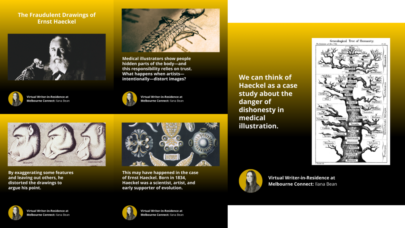
Medical illustrators show people parts of the body that are usually hidden—and this responsibility requires a lot of trust. Because the average person can’t simply observe something like a developing human embryo themselves, they have to be able to believe that a medical illustrator is representing the world honestly and accurately. But what happens when artists—perhaps intentionally—distort medical images to make a point?
This may have happened in the case of Ernst Haeckel. Born in 1834, Haeckel was a scientist, artist, and early supporter of evolution. Like Darwin, he believed that humans were descended from ancestors of different species, but unlike Darwin, he didn’t credit this to natural selection. Instead, he thought that evolution has a built in direction—that animals were always advancing to a higher form.
The chart shows Haeckel’s view of phylogeny—a term that refers to a group’s evolutionary history. Haeckel places humans on top of a ladder, which ranks animals in a hierarchy. On the right is a more contemporary version of the chart, which depicts evolution as less like a ladder, and more like a tree. It tracks how species are related, but doesn’t imply that there’s a destination. In this version, animals aren’t evolving into something better, rather than something better suited for their particular environment.
Haeckel believed that during embryonic and fetal development, more advanced creatures like humans went through stages where they looked like their primitive ancestors. First, a human embryo might go through a fishlike phase where they would have gill-like structure. Later, they would turn into a pig-like fetus. Haeckel created a series of images comparing the development of embryos of different species to make this argument. By exaggerating some features and leaving out others (like not showing limb buds in some mammals), he distorted the drawings to argue his point. When you look at his illustration compared to later photographs, you can see how different they are.
Haeckel’s drawings didn’t just stay in his notebook as a fringe theory. They actually appeared in textbooks—and kicked off the long-running myth that human fetuses have gills. Now, scientists see them as inaccurate—and many argue, fraudulent.
Haeckel’s work left a dark legacy. Many of his ideas— including biological hierarchy—had long lasting impacts that fueled scientific racism. His work was read by leaders in the Nazi movement and used to support their pre-existing biases.
We can think of Haeckel as a case study about the danger of dishonesty in medical illustration. Since Haecekl, molecular research has shown that early embryos from different species do have a lot in common. But it’s not because they’re changing into each other: we all start out with similar bases, and then gain specific features that make us ourselves.

When you think about geographic maps and medical illustration, they have a lot in common. Both teach you how to interpret space: one shows you spaces inside the body, and the other shows you space beyond it. The relationship between cartography and medical illustration runs deep—in fact, two of the most influential figures in each field’s history actually committed crimes together.
Let’s back up and talk about Renaissance anatomist, Andreas Vesalius. Vesalius is famous for creating the first comprehensive anatomical atlas, De Humani Corporis Fabrica Libri Septem (which translates to Of the Fabric of the Human Body in Seven Texts, and is often referred to simply as the Fabrica.) He’s called the “father” of medical illustration, because his work permanently changed the way that anatomy was taught in the Western tradition. Today, it’s hard to imagine learning anatomy without visual aids, but in Vesalius’s time, students usually focused on reading translations from Ancient Greek thinkers. Vesalius changed this by encouraging students to examine what they could actually see.
To make his atlas, Vesalius needed access to a lot of bodies, which he didn’t always have. As a student in University of Leiden, he used to break into cemeteries and steal old skeletons to study. He wrote about going on this mission in the night with his friend, Gemma Frisius.
You might not have heard the name Gemma Frisius, but you’ve definitely seen work that he contributed to. Frisius was a scholar of many different subjects—including math, philosophy, and cartography. He was also a professor and mentor to Gerardus Mercator, who added upon Frisius’s work created the Mercator projection—the most popular representation of the world today. If you open up Google Maps on your phone, you’re looking at a modern-day version of his work. The Mercator projection is really good for navigation, but pretty bad at showing land size accurately. It famously depicts Africa and Greenland as the same size, even though Africa is actually four times bigger. This isn’t exactly because it’s a bad map, but because all maps distort for distance, direction, shape, or area. It simply isn’t possible to flatten a 3D object into a 2D space.
If medical illustration is also trying to accomplish the same goal—putting a complex 3D shape in a 2D image—it’s worth asking: what might it distort?


